Part I
Question 1 Discussion
The first question tested the following null and alternative
hypotheses of a correlation analysis:
Null: There is no linear relationship between distance (ft)
and sound level (dB).
Alternative: There is a linear relationship between distance (ft) and sound level (dB).
A correlation
analysis like this one measures the association between 2 variables. To
test this hypothesis, a Pearson
Correlation value, which indicates the strength of the covariation between
variables, was calculated in IBM SPSS Statistics 24, shown in figure 1.
 |
| Figure 1. SPSS correlation analysis of distance (ft) and sound level (dB). |
Then the data was graphed via a scatter plot, a 2-D graph that portrays the
association and direction of variables, in excel to provide a visual context
for the Pearson Correlation shown in figure 2.
 |
| Figure 2. Graph of distance (ft) and sound level (dB) with a trend line. |
The SPSS bivariate correlation analysis shows a significant result at
the 0.01 level for a two-tailed test with a Pearson Correlation of -0.896. The significance was 0.000. The Pearson Correlation number indicates that
the relationship between distance and sound level is negative and that the
correlation strong (close to -1). The
significance was 0.000, which is smaller than the significance level of 0.005,
so the result is significant and thus the null hypothesis, that there is no
linear relationship between distance (ft) and sound level (dB), is
rejected. This is also denoted by the
two stars ** placed by the Pearson Correlation.
The scatter plot in figure 2 supports this analysis because all the data
points are clustered around the trend line and the trend line has a negative
slope, thus a negative relationship.
Question 2 Discussion
For question two, a
correlation matrix was created to test the relationships between different
races and other variables in Detroit, MI. The results
are shown in figure 3 below.
 |
| Figure 3. Correlation Matrix of races and several variables. |
The overall null and alternative hypotheses for each race
and each variable is as follows:
Null: there is no linear relationship between (White, Black, Asian, Hispanic) and (Bachelor’s Degree, Median Household Income, Median Home Value, Manufacture Jobs, Retail Jobs, Finance Jobs).
Alternative: There is a linear relationship between (White, Black, Asian, Hispanic) and (Bachelor’s Degree, Median Household Income, Median Home Value, Manufacture Jobs, Retail Jobs, Finance Jobs).
Out of all the races, only Hispanic did not have a significant correlation with bachelor’s degree and it also had a very weak correlation to begin with. White, Black, and Asian all had significant Pearson Correlations at the 0.01 level for a two-tailed test, but White had the highest and a positive correlation (0.698), Asian came in second with a moderately positive correlation (0.559), and Black had a negative weak correlation (-0.305).
For median household income, Hispanic had a significant correlation at the 0.05 level for a two-tailed test and the other three had a significant result at the 0.01 level for a two-tailed test. Hispanic and Black had a very weak negative correlation (-0.078 and -0.408 respectively), and white and Asian had a moderately positive correlation (0.554 and 0.388 respectively).
Median home values were significantly correlated with all races at the 0.01 level (two-tailed), but White had the highest positive correlation with 0.486, Asian not far behind with 0.436, and Black and Hispanic had weak negative correlations with -0.362 and -0.092 respectively.
In manufacturing jobs only Black was negatively correlated, albeit very weak, at -0.085, Asian was significant and positive at the 0.05 (two-tailed) level at 0.077, and White and Hispanic had no significant correlation.
For retail jobs, White, Black, and Asian were all significant at the 0.01 (two-tailed) level with Asian having the highest positive correlation at 0.259, then White at 0.184, and finally Black with a negative correlation at -0.146. All the correlations were weak and Hispanic had a very weak non-significant correlation.
Finally, Only Asian had a significant correlation with finance jobs at the 0.01 (two-tailed) level at 0.097 while the other races had no significant correlation to finance jobs.
In an article published by Emmons and Ricketts, family wealth increases with education. In addition, "at every level of educational attainment, the wealth effects of education for Hispanics and African-Americans are lower than they are for non-Hispanic Whites and Asian" (Emmons and Ricketts). The variables tested in addition to bachelor's degree all relate to wealth in one way or another, which ties back to education leading to more wealth. For example, a person with more wealth has a higher paying job (finance or retail are higher paying than manufacturing jobs) and more than likely have a higher median home value. The results of the correlation analysis described next support the findings of Emmons and Ricketts on education and wealth affluence.
Overall, the results indicate that Hispanics seem not have a relationship, or if it was present it was a weak one, between their race and the variables listed. An assumption can be made that Whites are most likely to be educated because they have the highest significant correlation, thus they are also most likely to have a higher median income and home value. They have no correlation to lower paying jobs in manufacturing, but have some correlation to retail jobs. Blacks are the opposite, less likely to be educated based on a negative correlation, thus a lower median household income and home value and more likely to be in manufacturing jobs. Asians seem to do well (not as good as whites) in earning an education and having a high median household income and home value. They have a good chance of having a retail job and also have a significant positive correlation to finance jobs. These results would indicate that Whites are the most well-off followed by Asians. It is hard to tell with Hispanics because there are no inherent trends and Blacks fare the worst of the four races in Detroit, MI.
Part II
Introduction:
For elected politicians it is important to understand the
voting patterns in their jurisdiction.
These patterns can be analyzed via spatial autocorrelation analysis
utilizing GeoDa and SPSS. Spatial autocorrelation is the
correlation of a variable with itself through space. The Texas Election
Commission (TEC) has provided 1980 and 2012 Presidential Election data which
includes both percent Democratic votes and voter turnout for each year. Hispanic populations for 2010 will be
downloaded from the U.S. Census website.
The TEC wants this data used to determine if there is clustering of
voting patterns and of voter turnout in the state. A written report of the steps of this
analysis are given below to determine if there is clustering of either voting
patterns or voter turnout in the state of Texas.
Methods:
First, data on the Hispanic population in 2010 was
downloaded from the U.S. Census website along with a shapefile of the counties
in the state of Texas. Next, the data
was formatted to only include the percentage of Hispanics in each county. The voting data provided by TEC and the
downloaded Hispanic Population data was joined to the shapefile based on the
Geo_ID field. Finally, the data was
exported into a new shapefile to be processed in GeoDa.
The shapefile was opened in GeoDa to determine if there was
spatial autocorrelation for elections, voter turnout, and Hispanic
populations. A spatial weight was
created using weights manager in GeoDa to accomplish this task. Scatter plots of the Moran’s I for The percent
democratic vote for the 1980 and 2012 presidential election, the voter turnout
in 1980 and 2012, and the percent Hispanic population were all created. In
addition, a LISA cluster map for the previously mentioned variables was also
created. Finally, a correlation matrix
for all the variables was created in SPSS to test the relationships of the
variables.
Results:
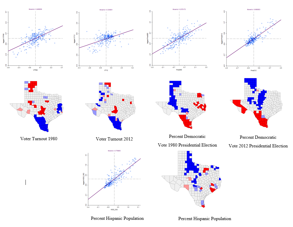 |
| Figure 4. Scatter plots and LISA maps for percent democratic vote for the 1980 and 2012 presidential election, the voter turnout in 1980 and 2012, and the percent Hispanic population. |
 |
| Figure 4a. Legend for all LISA maps shown above. |
Figure 4 above shows the final scatter plots and LISA charts
from GeoDa for the percent democratic vote for the 1980 and 2012 presidential
election, the voter turnout in 1980 and 2012, and the percent Hispanic
population. The maps are a visual
representation of the scatter plots and Moran’s
I number, which is an indicator of the strength of the spatial
autocorrelation. Figure 4a shows the legend that applies to all LISA maps.
For voter turnout in 1980, the data had a Moran’s I of 0.468 and combined with the scatter plot had a moderate positive autocorrelation. In general, the map shows a high voter turnout clustering in the northern and central part of Texas and a low voter turnout clustering in the southern and western part of the state.
For voter turnout 2012, the data had a Moran’s I value of 0.336 and combined with the scatter plot shows a low positive autocorrelation. In general, the map shows a high voter turnout clustering in the northern part of Texas and low voter turnout clustering just below the high voter turnout in northern Texas and in the southern portion of the state.
For the percent democratic vote in the 1980 presidential election, the data had a Moran’s I of 0.575, and so the scatter plot shows a moderate positive autocorrelation. The map shows low democratic voters in the northern and eastern half of the state and high democratic voters in the western and southern portion of Texas.
For the percent democratic vote in the 2012 presidential election, the data had a Moran’s I of 0.696, so the scatter plot depicts a high positive autocorrelation of the democratic vote in 2012. The map shows low democratic voter percentage in the northern and northeastern portion of Texas and high democratic voter percentage in the southern and western part of the state.
Finally, the percent Hispanic population data had a Moran’s I of 0.779 and the scatter plot shows a high positive autocorrelation. The map shows a low percentage of Hispanics in the northern and northwestern part of Texas and a high percentage of Hispanics in the southern and southwestern part of Texas. This last finding concerning Hispanic autocorrelation is also supported by comparing the LISA map to a map of the percent Hispanic Populations in Texas shown in Figure 5 below.
This map shows a higher population of Hispanics in the southern and southwestern portion of the state, which supports the LISA map of low and high clustering of Hispanic counties. This pattern could be due to the proximity to the Mexican border.
For voter turnout in 1980, the data had a Moran’s I of 0.468 and combined with the scatter plot had a moderate positive autocorrelation. In general, the map shows a high voter turnout clustering in the northern and central part of Texas and a low voter turnout clustering in the southern and western part of the state.
For voter turnout 2012, the data had a Moran’s I value of 0.336 and combined with the scatter plot shows a low positive autocorrelation. In general, the map shows a high voter turnout clustering in the northern part of Texas and low voter turnout clustering just below the high voter turnout in northern Texas and in the southern portion of the state.
For the percent democratic vote in the 1980 presidential election, the data had a Moran’s I of 0.575, and so the scatter plot shows a moderate positive autocorrelation. The map shows low democratic voters in the northern and eastern half of the state and high democratic voters in the western and southern portion of Texas.
For the percent democratic vote in the 2012 presidential election, the data had a Moran’s I of 0.696, so the scatter plot depicts a high positive autocorrelation of the democratic vote in 2012. The map shows low democratic voter percentage in the northern and northeastern portion of Texas and high democratic voter percentage in the southern and western part of the state.
Finally, the percent Hispanic population data had a Moran’s I of 0.779 and the scatter plot shows a high positive autocorrelation. The map shows a low percentage of Hispanics in the northern and northwestern part of Texas and a high percentage of Hispanics in the southern and southwestern part of Texas. This last finding concerning Hispanic autocorrelation is also supported by comparing the LISA map to a map of the percent Hispanic Populations in Texas shown in Figure 5 below.
 |
| Figure 5. Percent of the population that is Hispanic in counties in Texas, USA. |
Looking at the maps and the data, patterns appear between
certain variables. To test the
relationship between these variables, a bivariate correlation matrix was
created for the variables to determine if there is a linear relationship
between variables that could support the coinciding spatial
autocorrelation. The results are shown
in Figure 6.
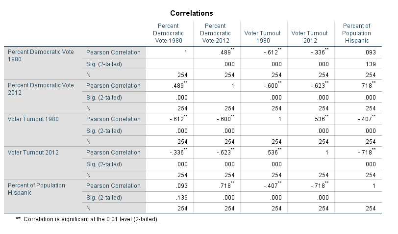 |
| Figure 6. Correlation matrix for the 1980 and 2012 presidential election, the voter turnout in 1980 and 2012, and the percent Hispanic population. |
The null and alternative hypotheses state the following:
Null: There is no linear relationship between (population
variable 1) and (population variable 2).
Alternative: There is a linear relationship between (population variable 1) and (population variable 2).
To test these hypotheses, Pearson Correlations were created
in the correlation matrix in SPSS. All
results unless otherwise stated are significant at the 0.01 level for a
two-tailed test.
For the percent democratic vote and the voter turnout in 1980, there was a significant negative correlation with a Pearson Correlation value of -0.612. Therefore, we reject the null hypothesis that there is no linear relationship between the percent democratic vote in 1980 and the voter turnout in 1980.
For the percent democratic vote in 2012 and the voter turnout in 2012, there was a significant negative correlation with a Pearson Correlation value of -0.623. Therefore we reject the null hypothesis that there is no linear relationship between the percent democratic vote in 2012 and the voter turnout in 2012.
There was a significant positive correlation between the percent Hispanic population and the percent democratic vote in the 2012 presidential election with a Pearson’s Correlation value of 0.718. Therefore we reject the null hypothesis that there is no linear relationship between the percent democratic vote in 2012 and the percent Hispanic population.
There was a significant negative correlation between percent Hispanic population and the voter turnout in 1980 with a Pearson Correlation value of -0.407. . Therefore we reject the null hypothesis that there is no linear relationship between voter turnout in 1980 and the percent Hispanic population.
Finally. there was also a significant negative correlation between the percent Hispanic population and the voter turnout in 2012 with a Pearson Correlation value of -0.718. . Therefore we reject the null hypothesis that there is no linear relationship between the voter turnout in 2012 and the percent Hispanic population.
Conclusion:
These results reveal that certain variables that show
autocorrelation clustering also show correlation amongst other variables. There was a negative linear relationship
between the percent democratic vote in the 1980 and 2012 presidential elections
and voter turnouts in 1980 and 2012. The LISA maps support this correlation:
the southern half of Texas has high percent democratic vote counties and low
voter turnout counties. However just because there is a correlation does not
mean causation can be implied, such as saying that more voters turning up on
election day causes a smaller democratic vote. Other variables could be the
causal factor as well. When the Hispanic
population is also factored in, it has a positive correlation to the percent
democratic vote in the 2012 presidential election and a negative correlation
with the voter turnout in both 1980 and 2012.
The maps also support this shown by the overlap of counties with a
clustering of Hispanic populations and counties with a high percent democratic
vote in both the 1980 and the 2012 election. To further support this finding, scatter plots comparing the percent Hispanic population to voter turnouts and percent democratic vote were created and are pictured below.
In figure 7, the scatter plots support the Pearson Correlation values stating there is a negative linear relationship between voter turnout in 1980 and 2012 and percent Hispanic population as well as the the stronger correlation in 2012 (trend line has a steeper slope). In figure 8, the scatter plot for the percent Democratic vote in 2012 and percent Hispanic population supports the significant Pearson Correlation value stating there is a positive linear relationship between the two variables.
There could be several explanations for these findings. From 2000 to 2015, the Hispanic population in Texas grew from 6.7 million to 10.7 million (Flores). In addition, Hispanics in the U.S. have historically identified with the Democratic Party because they believe the Democratic Party has more concern for Latinos or Hispanics than the Republican Party (Lopez et al.). These facts support the positive correlation between the Hispanic population and the Democratic vote as well as the increased positive correlation between the two variables from 1980 to 2012. Motel and Patten found that Hispanics are more likely than Whites to have less education and a lower socioeconomic status. This contributes to a lower voter turnout for a number of reasons, including lack of political knowledge, lack of engagement, and others. This supports the negative correlation between the Hispanic population and voter turnouts in 1980 and 2012.
 |
| Figure 7. Percent Hispanic population and voter turnout in 1980 and 2012 presidential elections comparison. |
 |
| Figure 8. Percent Hispanic population and percent Democratic Vote in 1980 and 2012 presidential elections comparison. |
There could be several explanations for these findings. From 2000 to 2015, the Hispanic population in Texas grew from 6.7 million to 10.7 million (Flores). In addition, Hispanics in the U.S. have historically identified with the Democratic Party because they believe the Democratic Party has more concern for Latinos or Hispanics than the Republican Party (Lopez et al.). These facts support the positive correlation between the Hispanic population and the Democratic vote as well as the increased positive correlation between the two variables from 1980 to 2012. Motel and Patten found that Hispanics are more likely than Whites to have less education and a lower socioeconomic status. This contributes to a lower voter turnout for a number of reasons, including lack of political knowledge, lack of engagement, and others. This supports the negative correlation between the Hispanic population and voter turnouts in 1980 and 2012.
Overall, the voter turnout in 1980, percent democratic vote
in both the 1980 and 2012 presidential elections, and the percent Hispanic
population shows clustering. The percent
Hispanic population has a significant positive correlation to the percent
democratic vote in the presidential election of 2012 and a significant negative
correlation to the voter turnout in 1980 and 2012. The percent democratic vote in the
presidential election of 1980 and 2012 has a significant negative correlation
to the voter turnout in both years. This
could imply that Hispanics make up a large portion of the democratic vote in
Texas and the increase in the Hispanic population could mean an increase in democrat voters. The
TEC can assume from these findings that there is clustering of the variables
listed above (percent democratic vote in both the 1980 and 2012 presidential
elections, percent Hispanic population).
The correlations and assumptions presented afterwards are possible
explanations for this clustering, but further analysis is needed to draw any
concrete conclusions.
Emmons, W.R. and Ricketts, L.R. "Unequal Degrees of Affluence: Racial and Ethnic Wealth Differences across Education Levels." Regional Economist, October 2016, pp. 1-3.
Flores, Antonio. "How the U.S. Hispanic population is changing." Pew Research Center, http://www.pewresearch.org/fact-tank/2017/09/18/how-the-u-s-hispanic-population-is-changing/. Accessed 28 November 2017.
Lopez, Mark, Hugo. et al. "Democrats maintain edge as party 'more concerned' for Latinos, but views similar to 2012." Pew Research Center, http://www.pewhispanic.org/2016/10/11/democrats-maintain-edge-as-party-more-concerned-for-latinos-but-views-similar-to-2012/. Accessed 28 November 2017.
Motel, Seth, Patten, Eileen. "Latinos in the 2012 Election: Texas." Pew Research Center, http://www.pewhispanic.org/fact-sheet/latinos-in-the-2012-election-texas/. Accessed 28 November 2017.
Sources:
American Fact Finder, U.S. Department of Commerce, 2017. https://factfinder.census.gov/faces/nav/jsf/pages/index.xhtml. Accessed 11 November 2017.Emmons, W.R. and Ricketts, L.R. "Unequal Degrees of Affluence: Racial and Ethnic Wealth Differences across Education Levels." Regional Economist, October 2016, pp. 1-3.
Flores, Antonio. "How the U.S. Hispanic population is changing." Pew Research Center, http://www.pewresearch.org/fact-tank/2017/09/18/how-the-u-s-hispanic-population-is-changing/. Accessed 28 November 2017.
Lopez, Mark, Hugo. et al. "Democrats maintain edge as party 'more concerned' for Latinos, but views similar to 2012." Pew Research Center, http://www.pewhispanic.org/2016/10/11/democrats-maintain-edge-as-party-more-concerned-for-latinos-but-views-similar-to-2012/. Accessed 28 November 2017.
Motel, Seth, Patten, Eileen. "Latinos in the 2012 Election: Texas." Pew Research Center, http://www.pewhispanic.org/fact-sheet/latinos-in-the-2012-election-texas/. Accessed 28 November 2017.


No comments:
Post a Comment