Thursday, December 14, 2017

Assignment 6- Regression Analysis


Part I

Introduction:

Many political arguments exist as to the cause of poverty in urban areas.  The determined causes of poverty will influence the policies put in place for healthcare and other social welfare programs. A study was conducted on crime rates and poverty in a certain town.  The local news station obtained data that claimed the crime rate increased as the number of kids that received free lunches increased.  To determine if this claim is correct, a linear regression analysis was conducted on the data to determine if the relationship exists or not.  

Methods:

First, the data obtained from Dr. Ryan Weichelt of the University of Wisconsin-Eau Claire in the form of an excel document was used to create a scatter plot in excel with a trend line and corresponding equation.  Next, the data was inputting into IBM SPSS Statistics 24 to run a linear regression analysis, a statistical tool used to investigate the relationship between variables, which included the regression coefficient (B), a number that shows how responsive the dependent variable is to the change in the independent variable and the coefficient of determination (R squared) that illustrates how much of the dependent variable is explained by the independent variable. The scatter plot is pictured below in figure 1 and the results of the linear regression analysis are shown in figure 2. Finally, the results of the SPSS calculations were used to test the following hypotheses:

Null: There is no linear relationship between the percent of kids receiving a free lunch (independent variable) and the crime rate (dependent variable).

Alternative: There is a linear relationship between the percent of kids receiving a free lunch (independent variable) and the crime rate (dependent variable).

(Independent variable is the variable that explains the dependent variable and the dependent variable is explained by the independent variable).


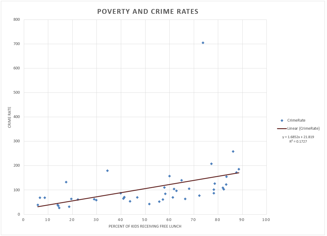
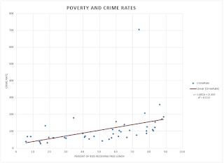
Figure 1. Scatter plot of the percent of kids who receive free lunch and the crime rate.


Figure 2. Model summary and hypothesis test results for percent of kids who receive free lunch and the crime rate.

Results:

The scatter plot and the trend line show a positive relationship between the percent of kids receiving a free lunch and the crime rate.  The positive relationship is derived from the positive value of the slope, or regression coefficient.  The regression coefficient indicates that for every one percent increase in the amount of kids receiving a free lunch, the crime rate increases by 1.685 percent. The low value of 0.173 for r2, or the coefficient of determination, in figure 2 indicates that the crime rate is weakly explained by the percent of kids receiving a free lunch.  

The significance level for the two-tailed t test at a 95% confidence interval, shown in figure 2 is 0.005, thus the null hypothesis is rejected that there is no linear relationship between the percent of kids receiving a free lunch and the crime rate.  

Finally, using the equation of the trend line, if a new area in town was identified as having 30% with a free lunch, the corresponding crime rate would be 72.375.  I would not be very confident in this result because although there is a linear relationship between percent of kids with a free lunch and crime rate, the amount of variation in crime rate explained by percent free lunch is very small as indicated by the r2 value. 

Conclusion:

The null hypothesis in this scenario was rejected, indicating there is a positive linear relationship between percent of kids receiving a free lunch and the crime rate.  However, the r2 value is very low so the variation in crime rate explained by percent of kids receiving a free lunch is low.  This indicates that there is another variable or variables that explains crime rate better than percent of kids receiving a free lunch.  Technically, the news station is correct, as the number of kids that get free lunches increases, so does crime.  However, this does not explain the crime rate very well, and these results could be misinterpreted so I would be cautious about publishing these results to the public. 

Part II

Introduction:

A major portion of public safety in an urban area is the responsiveness of the first responders. Because of this, the City of Portland, Oregon is concerned with adequate response times to 911 calls. To better serve the city, officials want to know what factors might explain where 911 calls come from.  In addition, a local company is interested in building a new hospital in the area and they would like to know where to place their hospital. The best location of this hospital would be in an area that receives a high number of 911 calls. Thus these two questions would benefit from a study on the factors that explain where 911 calls originate from. The two questions answered in this section are as follows: determining what factors might provide explanations as to where most 911 calls come from in Portland, Oregon and determining the best place to build a new hospital. 

Methods:

First, data including number of 911 calls per census tract in Portland, number of jobs, number of renters, and number of people with no HS degree was imported to IBM SPSS Statistics 24.  Then the dependent variable was set to the number of 911 calls and the independent variables were set to the number of jobs, number of renters, and number of people with no high school degree. An individual linear regression analysis was completed for each independent variable.

 Then three scatter plots were created for each variable and the number of 911 calls in Microsoft Excel. Next, choropleth maps of the number of 911 calls per census tract, the number of renters per census tract, and a standardized residual map of the number of renters, which had the highest r2 value, were created. Residuals refers to the amount of deviation of each point from the best fit or regression line.The standardized residual map is a visual depiction of the standard deviation of these residuals. Finally, the results of the regression analysis were used to test the following hypotheses:


Null: There is no linear relationship between (number of jobs, number of people with no high school degree, or number of renters) and number of 911 calls. 

Alternative: There is a linear relationship between (number of jobs, number of people with no high school degree, or number of renters) and number of 911 calls.

Results:


Figure 3. Scatter plot of the number of jobs and the number of 911 calls.

Figure 4. Model summary and hypothesis test results for the number of jobs and number of 911 calls.


The slope value shown in figure 3 states that for every job, there is an increase of 0.007 in the number of 911 calls.  This positive relationship is determined from the positive value of the slope (B value). The significance level for the hypothesis test of 911 calls and number of jobs shown in figure 4 is 0.000 for a two-tailed 95% t test, therefore the null hypothesis is rejected and there is a positive linear relationship between the number of jobs and the number of 911 calls.  The r2 value is 0.340, which is fairly weak and suggests that jobs are not good at explaining the variation in the number of 911 calls.
Figure 5. Scatter plot of people without a high school degree and number of 911 calls.
Figure 6. Model Summary and hypothesis test results of people without a high school degree and number of 911 calls.

The slope value in figure 5 states that for every person without a high school degree, there is an increase of 0.166 in the number of 911 calls.  This positive relationship is determined from the positive value of the slope (B value). The significance level for the hypothesis test of 911 calls and number of people without a high school degree is 0.000 for a two-tailed 95% t test, therefore the null hypothesis is rejected and there is a positive linear relationship between the number of renters and the number of 911 calls.  The r2 value is 0.567, close to 1 and therefore the number of people without a high school degree explains a fair amount (less than the number of renters but more than the number of jobs) of the variation in the number of 911 calls.
Figure 7. Scatter plot of the number of renters and number of  911 calls.
Figure 8. Model Summary and hypothesis test results of the number of renters and the number of 911 calls.

The slope value states that for every renter, there is an increase of 0.066 in the number of 911 calls.  The positive relationship is determined from the positive value of the slope (B value). The significance level for the hypothesis test of 911 calls and number of renters is 0.000 for a two-tailed 95% t test, therefore the null hypothesis is rejected and there is a positive linear relationship between the number of renters and the number of 911 calls.  The r2 value is 0.616, close to 1 and therefore the number of renters explainss a good amount of the variation in the number of 911 calls.

Figure 9. Choropleth map of the number of 911 calls per census tract in Portland, Oregon.
Figure 10. Number of renters per census tract in Portland, Oregon.

Figure 11. Standardized residual map of the number of renters per census tract in Portland, Oregon with a potential hospital site.
Figure 9 shows a choropleth map of the number of 911 calls per census tract in Portland, Oregon and has census tracts outlined in black that have more than 830 renters (highest category in figure 10). There are more calls in the central portion of the city than the outside census tracts shown by the brighter red colors in the center of the city. One can also see that census tracts with a high number of 911 callers also have a high number of renters, which supports the regression analysis completed earlier in figure 8. Figure 10 is choropleth map of the number of renters per census tract for the entire city of Portland, Oregon. Again, the areas with a darker green color indicate more renters and mirrors the brighter red colors in figure 9 with more 911 calls. In figure 11 the census tracts with a bright red or bright blue color had a squared vertical distance value (from the trend line) that was substantially above or below the regression line respectively (over or under-predicted). Specifically, these points had a larger or smaller number of 911 calls per increase in renters than the regression line predicted. On the scatter plot, these would be points that are very high or very low compared to the regression line. For analyzing this data, the mean is 318, the median is 191, the mode is 80, and the standard deviation is 340. Outlined in black in figure 11 is a potential hospital site based on the highest deviation from the trend line.

Conclusion:

Overall three independent variables, the number of jobs, number of people without a high school degree, and number of renters, were tested with the number of 911 calls as the dependent variable in census tracts in the City of Portland, Oregon.  Of the three, the number of renters predicted the most variation in the number of 911 calls with a coefficient of determination of 0.616.  Thus out of the three variables tested the number of renters might provide the most explanation as to where most 911 calls come from.  In fact, out of all the variables listed in the data, renters has the highest coefficient of determination. From the data provided, the City of Portland can thus determine that the number of renters would provide the most explanation as to where the most calls come from. However the number of renters only explained 61.6% of the variation in the number of 911 calls, so further research would need to be conducted to determine the other variables that explain variation in number of 911 calls.

 From this conclusion, a company can also use the census tracts with the highest number of renters to determine where to build a hospital.  The census tracts with higher numbers of renters would be ideal places to have a new hospital built because the number of renters explains the most variation in the number of 911 calls.  Based on this, the census tract with the highest standard deviation from the trend line, that is the census tract with the most 911 calls based on the number of renters, would be the ideal choice of location to build a hospital. This site is outlined in figure 11. However, this data is limited and it only 61.6% of the variation in number of 911 calls, so there are other variables that should be considered to make a fully informed decision on where to put a new hospital. Other variables to be considered include road placement, the weighted mean center of the population, and correct zoning areas for a hospital.


Monday, November 27, 2017

Assignment 5- Correlation and Spatial Autocorrelation


Part I

Question 1 Discussion

The first question tested the following null and alternative hypotheses of a correlation analysis:

Null: There is no linear relationship between distance (ft) and sound level (dB).

Alternative: There is a linear relationship between distance (ft) and sound level (dB).

A correlation analysis like this one measures the association between 2 variables. To test this hypothesis, a Pearson Correlation value, which indicates the strength of the covariation between variables, was calculated in IBM SPSS Statistics 24, shown in figure 1. 

Figure 1. SPSS correlation analysis of distance (ft) and sound level (dB).
Then the data was graphed via a scatter plot, a 2-D graph that portrays the association and direction of variables, in excel to provide a visual context for the Pearson Correlation shown in figure 2.   

Figure 2. Graph of distance (ft) and sound level (dB) with a trend line.
The SPSS bivariate correlation analysis shows a significant result at the 0.01 level for a two-tailed test with a Pearson Correlation of -0.896.  The significance was 0.000.  The Pearson Correlation number indicates that the relationship between distance and sound level is negative and that the correlation strong (close to -1).  The significance was 0.000, which is smaller than the significance level of 0.005, so the result is significant and thus the null hypothesis, that there is no linear relationship between distance (ft) and sound level (dB), is rejected.  This is also denoted by the two stars ** placed by the Pearson Correlation.  The scatter plot in figure 2 supports this analysis because all the data points are clustered around the trend line and the trend line has a negative slope, thus a negative relationship. 

Question 2 Discussion

 For question two, a correlation matrix was created to test the relationships between different races and other variables in Detroit, MI.  The results are shown in figure 3 below. 
Figure 3. Correlation Matrix of races and several variables.

The overall null and alternative hypotheses for each race and each variable is as follows:

Null: there is no linear relationship between (White, Black, Asian, Hispanic) and (Bachelor’s Degree, Median Household Income, Median Home Value, Manufacture Jobs, Retail Jobs, Finance Jobs).

Alternative: There is a linear relationship between (White, Black, Asian, Hispanic) and (Bachelor’s Degree, Median Household Income, Median Home Value, Manufacture Jobs, Retail Jobs, Finance Jobs).

Out of all the races, only Hispanic did not have a significant correlation with bachelor’s degree and it also had a very weak correlation to begin with.  White, Black, and Asian all had significant Pearson Correlations at the 0.01 level for a two-tailed test, but White had the highest and a positive correlation (0.698), Asian came in second with a moderately positive correlation (0.559), and Black had a negative weak correlation (-0.305). 

For median household income, Hispanic had a significant correlation at the 0.05 level for a two-tailed test and the other three had a significant result at the 0.01 level for a two-tailed test.  Hispanic and Black had a very weak negative correlation (-0.078 and -0.408 respectively),  and white and Asian had a moderately positive correlation (0.554 and 0.388 respectively).

 Median home values were significantly correlated with all races at the 0.01 level (two-tailed), but White had the highest positive correlation with 0.486, Asian not far behind with 0.436, and Black and Hispanic had weak negative correlations with -0.362 and -0.092 respectively.

In manufacturing jobs only Black was negatively correlated, albeit very weak, at -0.085, Asian was significant and positive at the 0.05 (two-tailed) level at 0.077, and White and Hispanic had no significant correlation. 

For retail jobs, White, Black, and Asian were all significant at the 0.01 (two-tailed) level with Asian having the highest positive correlation at 0.259, then White at 0.184, and finally Black with a negative correlation at -0.146.  All the correlations were weak and Hispanic had a very weak non-significant correlation.

 Finally, Only Asian had a significant correlation with finance jobs at the 0.01 (two-tailed) level at 0.097 while the other races had no significant correlation to finance jobs.

In an article published by Emmons and Ricketts, family wealth increases with education.  In addition, "at every level of educational attainment, the wealth effects of education for Hispanics and African-Americans are lower than they are for non-Hispanic Whites and Asian" (Emmons and Ricketts).  The variables tested in addition to bachelor's degree all relate to wealth in one way or another, which ties back to education leading to more wealth. For example, a person with more wealth has a higher paying job (finance or retail are higher paying than manufacturing jobs) and more than likely have a higher median home value.  The results of the correlation analysis described next support the findings of Emmons and Ricketts on education and wealth affluence.

Overall, the results indicate that Hispanics seem not have a relationship, or if it was present it was a weak one, between their race and the variables listed.  An assumption can be made that Whites are most likely to be educated because they have the highest significant correlation, thus they are also most likely to have a higher median income and home value.  They have no correlation to lower paying jobs in manufacturing, but have some correlation to retail jobs.  Blacks are the opposite, less likely to be educated based on a negative correlation, thus a lower median household income and home value and more likely to be in manufacturing jobs.  Asians seem to do well (not as good as whites) in earning an education and having a high median household income and home value.  They have a good chance of having a retail job and also have a significant positive correlation to finance jobs.  These results would indicate that Whites are the most well-off followed by Asians.  It is hard to tell with Hispanics because there are no inherent trends and Blacks fare the worst of the four races in Detroit, MI. 

Part II

Introduction:

For elected politicians it is important to understand the voting patterns in their jurisdiction.  These patterns can be analyzed via spatial autocorrelation analysis utilizing GeoDa and SPSS.  Spatial autocorrelation is the correlation of a variable with itself through space. The Texas Election Commission (TEC) has provided 1980 and 2012 Presidential Election data which includes both percent Democratic votes and voter turnout for each year.  Hispanic populations for 2010 will be downloaded from the U.S. Census website.  The TEC wants this data used to determine if there is clustering of voting patterns and of voter turnout in the state.  A written report of the steps of this analysis are given below to determine if there is clustering of either voting patterns or voter turnout in the state of Texas.

Methods:

First, data on the Hispanic population in 2010 was downloaded from the U.S. Census website along with a shapefile of the counties in the state of Texas.  Next, the data was formatted to only include the percentage of Hispanics in each county.  The voting data provided by TEC and the downloaded Hispanic Population data was joined to the shapefile based on the Geo_ID field.  Finally, the data was exported into a new shapefile to be processed in GeoDa.
The shapefile was opened in GeoDa to determine if there was spatial autocorrelation for elections, voter turnout, and Hispanic populations.  A spatial weight was created using weights manager in GeoDa to accomplish this task.  Scatter plots of the Moran’s I for The percent democratic vote for the 1980 and 2012 presidential election, the voter turnout in 1980 and 2012, and the percent Hispanic population were all created. In addition, a LISA cluster map for the previously mentioned variables was also created.  Finally, a correlation matrix for all the variables was created in SPSS to test the relationships of the variables. 

Results:

Figure 4. Scatter plots and LISA maps for percent democratic vote for the 1980 and 2012 presidential election, the voter turnout in 1980 and 2012, and the percent Hispanic population.
Figure 4a. Legend for all LISA maps shown above.

Figure 4 above shows the final scatter plots and LISA charts from GeoDa for the percent democratic vote for the 1980 and 2012 presidential election, the voter turnout in 1980 and 2012, and the percent Hispanic population.  The maps are a visual representation of the scatter plots and Moran’s I number, which is an indicator of the strength of the spatial autocorrelation. Figure 4a shows the legend that applies to all LISA maps.

 For voter turnout in 1980, the data had a Moran’s I of 0.468 and combined with the scatter plot had a moderate positive autocorrelation.  In general, the map shows a high voter turnout clustering in the northern and central part of Texas and a low voter turnout clustering in the southern and western part of the state. 

 For voter turnout 2012, the data had a Moran’s I value of 0.336 and combined with the scatter plot shows a low positive autocorrelation.  In general, the map shows a high voter turnout clustering in the northern part of Texas and low voter turnout clustering just below the high voter turnout in northern Texas and in the southern portion of the state. 

 For the percent democratic vote in the 1980 presidential election, the data had a Moran’s I of 0.575, and so the scatter plot shows a moderate positive autocorrelation.  The map shows low democratic voters in the northern and eastern half of the state and high democratic voters in the western and southern portion of Texas. 

For the percent democratic vote in the 2012 presidential election, the data had a Moran’s I of 0.696, so the scatter plot depicts a high positive autocorrelation of the democratic vote in 2012.  The map shows low democratic voter percentage in the northern and northeastern portion of Texas and high democratic voter percentage in the southern and western part of the state. 

 Finally, the percent Hispanic population data had a Moran’s I of 0.779 and the scatter plot shows a high positive autocorrelation.  The map shows a low percentage of Hispanics in the northern and northwestern part of Texas and a high percentage of Hispanics in the southern and southwestern part of Texas. This last finding concerning Hispanic autocorrelation is also supported by comparing the LISA map to a map of the percent Hispanic Populations in Texas shown in Figure 5 below.
Figure 5. Percent of the population that is Hispanic in counties in Texas, USA.
This map shows a higher population of Hispanics in the southern and southwestern portion of the state, which supports the LISA map of low and high clustering of Hispanic counties. This pattern could be due to the proximity to the Mexican border.
Looking at the maps and the data, patterns appear between certain variables.  To test the relationship between these variables, a bivariate correlation matrix was created for the variables to determine if there is a linear relationship between variables that could support the coinciding spatial autocorrelation.  The results are shown in Figure 6.
Figure 6. Correlation matrix for the 1980 and 2012 presidential election, the voter turnout in 1980 and 2012, and the percent Hispanic population.

The null and alternative hypotheses state the following:

Null: There is no linear relationship between (population variable 1) and (population variable 2).

Alternative: There is a linear relationship between (population variable 1) and (population variable 2).

To test these hypotheses, Pearson Correlations were created in the correlation matrix in SPSS.  All results unless otherwise stated are significant at the 0.01 level for a two-tailed test.

For the percent democratic vote and the voter turnout in 1980, there was a significant negative correlation with a Pearson Correlation value of -0.612. Therefore, we reject the null hypothesis that there is no linear relationship between the percent democratic vote in 1980 and the voter turnout in 1980.  

 For the percent democratic vote in 2012 and the voter turnout in 2012, there was a significant negative correlation with a Pearson Correlation value of -0.623.  Therefore we reject the null hypothesis that there is no linear relationship between the percent democratic vote in 2012 and the voter turnout in 2012. 

There was a significant positive correlation between the percent Hispanic population and the percent democratic vote in the 2012 presidential election with a Pearson’s Correlation value of 0.718. Therefore we reject the null hypothesis that there is no linear relationship between the percent democratic vote in 2012 and the percent Hispanic population. 

There was a significant negative correlation between percent Hispanic population and the voter turnout in 1980 with a Pearson Correlation value of -0.407.  . Therefore we reject the null hypothesis that there is no linear relationship between voter turnout in 1980 and the percent Hispanic population.   

Finally. there was also a significant negative correlation between the percent Hispanic population and the voter turnout in 2012 with a Pearson Correlation value of -0.718.  . Therefore we reject the null hypothesis that there is no linear relationship between the voter turnout in 2012 and the percent Hispanic population. 

Conclusion:

These results reveal that certain variables that show autocorrelation clustering also show correlation amongst other variables.  There was a negative linear relationship between the percent democratic vote in the 1980 and 2012 presidential elections and voter turnouts in 1980 and 2012. The LISA maps support this correlation: the southern half of Texas has high percent democratic vote counties and low voter turnout counties. However just because there is a correlation does not mean causation can be implied, such as saying that more voters turning up on election day causes a smaller democratic vote. Other variables could be the causal factor as well.  When the Hispanic population is also factored in, it has a positive correlation to the percent democratic vote in the 2012 presidential election and a negative correlation with the voter turnout in both 1980 and 2012.  The maps also support this shown by the overlap of counties with a clustering of Hispanic populations and counties with a high percent democratic vote in both the 1980 and the 2012 election. To further support this finding, scatter plots comparing the percent Hispanic population to voter turnouts and percent democratic vote were created and are pictured below.
Figure 7. Percent Hispanic population and voter turnout in 1980 and 2012 presidential elections comparison.
Figure 8. Percent Hispanic population and percent Democratic Vote in 1980 and 2012 presidential elections comparison.
In figure 7, the scatter plots support the Pearson Correlation values stating there is a negative linear relationship between voter turnout in 1980 and 2012 and percent Hispanic population as well as the the stronger correlation in 2012 (trend line has a steeper slope). In figure 8, the scatter plot for the percent Democratic vote in 2012 and percent Hispanic population supports the significant Pearson Correlation value stating there is a positive linear relationship between the two variables.  

There could be several explanations for these findings. From 2000 to 2015, the Hispanic population in Texas grew from 6.7 million to 10.7 million (Flores).  In addition, Hispanics in the U.S. have historically identified with the Democratic Party because they believe the Democratic Party has more concern for Latinos or Hispanics than the Republican Party (Lopez et al.). These facts support the positive correlation between the Hispanic population and the Democratic vote as well as the increased positive correlation between the two variables from 1980 to 2012. Motel and Patten found that Hispanics are more likely than Whites to have less education and a lower socioeconomic status.  This contributes to a lower voter turnout for a number of reasons, including lack of political knowledge, lack of engagement, and others.  This supports the negative correlation between the Hispanic population and voter turnouts in 1980 and 2012.

Overall, the voter turnout in 1980, percent democratic vote in both the 1980 and 2012 presidential elections, and the percent Hispanic population shows clustering.  The percent Hispanic population has a significant positive correlation to the percent democratic vote in the presidential election of 2012 and a significant negative correlation to the voter turnout in 1980 and 2012.  The percent democratic vote in the presidential election of 1980 and 2012 has a significant negative correlation to the voter turnout in both years.  This could imply that Hispanics make up a large portion of the democratic vote in Texas and the increase in the Hispanic population could mean an increase in democrat voters.  The TEC can assume from these findings that there is clustering of the variables listed above (percent democratic vote in both the 1980 and 2012 presidential elections, percent Hispanic population).  The correlations and assumptions presented afterwards are possible explanations for this clustering, but further analysis is needed to draw any concrete conclusions.

Sources:

American Fact Finder, U.S. Department of Commerce, 2017. https://factfinder.census.gov/faces/nav/jsf/pages/index.xhtml. Accessed 11 November 2017.

Emmons, W.R. and Ricketts, L.R. "Unequal Degrees of Affluence: Racial and Ethnic Wealth Differences across Education Levels." Regional Economist, October 2016, pp. 1-3.

 Flores, Antonio. "How the U.S. Hispanic population is changing." Pew Research Center, http://www.pewresearch.org/fact-tank/2017/09/18/how-the-u-s-hispanic-population-is-changing/. Accessed 28 November 2017.

Lopez, Mark, Hugo. et al. "Democrats maintain edge as party 'more concerned' for Latinos, but views similar to 2012." Pew Research Center, http://www.pewhispanic.org/2016/10/11/democrats-maintain-edge-as-party-more-concerned-for-latinos-but-views-similar-to-2012/. Accessed 28 November 2017.

Motel, Seth, Patten, Eileen. "Latinos in the 2012 Election: Texas." Pew Research Center, http://www.pewhispanic.org/fact-sheet/latinos-in-the-2012-election-texas/. Accessed 28 November 2017.  
 

Assignment 6- Regression Analysis

Part I Introduction: Many political arguments exist as to the cause of poverty in urban areas.  The determined causes of poverty will ...