Types of Data
There are four main types of data: nominal, ordinal, interval, and ratio data. Nominal data is a discrete classification of data, that is each data point is put into a separate category. The data is qualitative in nature, and thus all that one knows is that the data points are separate. One example of this can be found on the United States Department of Agriculture Natural Resources Conservation Service (USDA NRCS) Soils Department (2005) that shows the Global soil regions. | |
| Figure 1. Global Soil Regions as described by the USDA NRCS Soils Department. |
Ordinal data is data that is placed in an order. With this data, one can say whether something is less or greater than another data point, but one cannot say by how much because the zero value is just a reference (Rogerson, 2015). A good example of this is a map describing the state well-being rankings for older Americans from best to worst (Adomaitis, 2017).
 | |
| Figure 2. State Well-being rankings from best to worst. |
Interval data is similar to ordinal data, but the difference or interval between data points' values can be discerned. However, the zero on the scale is not meaningful but simply a reference. In a map showing the average ACT score of each state, the difference between states can be quantified, but the zero on this scale is not meaningful so any ratio statement is not valid, like saying that the average ACT score of New York is four times as good as Arizona's (Lindbom, 2015).
 | |||
| Figure 3. Average ACT Scores by State showcasing interval data. |
 |
| Figure 4. Millennial median income by state, an example of ratio data. |
Map Production Using Census Data
Introduction
This section is based on a scenario in which an agriculture consulting/marketing company have asked for maps depicting were to increase USDA Certified Organic Farms. These maps utilize county level data about USDA Certified Organic Farms procured from the Census of Agriculture from U.S. Census data. This data will then be imported to an excel file, joined to a shapefile in ArcGIS, and then represented in equal interval maps based on range, quantile, and natural breaks. Finally, a discussion of which map is best to use will be provided.Methods
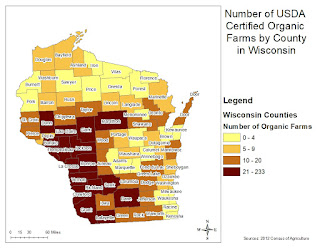
The first map shows the number of USDA Certified Organic Farms in equal intervals based on range. The ArcGIS program takes the range of the data and the number of classes selected, in this case four, and then divides the range by the number of classes to get four classes with equal sizes. This map is pictured below. |
| Figure 5. Number of USDA certified organic farms by county is Wisconsin denoted by equal interval based on range. |
The next map shows the same data, but the quantile method is used to display the data. This method places an equal amount of observations in each class based on the total number of observations in the data set. In Wisconsin, there are 72 counties, so 72 divided by 4 gives 18 counties per class. This method is shown below.
 |
| Figure 6. Number of USDA certified organic farms by county in Wisconsin denoted by the quantile classification method. |
The final map shows the same data once again, but the natural breaks method is employed. This method takes the data and looks for significantly large gaps between observations compared to other data points, at which point a class break is added. Again, the number of breaks is predetermined by the user, which in this case is four. Using this method, the one outlier gets a class of its own, and the rest of the counties are grouped with other counties with similar numbers of organic farms.
 |
| Figure 7. Number of USDA certified organic farms by county in Wisconsin denoted by the natural breaks method. |
Results and Discussion
For choosing which counties to market for an increase in the number of USDA certified organic farms, I would chose the third map that utilizes the natural breaks method based on the data, which is skewed to the left. The equal interval method, which takes the range and divides it by the number of classes to create equal intervals, has an interval for which there is no data, and the map itself does not visualize the range of data well. This can be seen by the overwhelming majority of the map showing counties in yellow. The quantile method puts an equal number of observations in each class, but this method has put counties with 20 farms, such as La Crosse, in the same class as Vernon with 233. This is a significantly large gap in data, and the range of counties put into the last class are ones that would require different marketing strategies. The map suggests that counties like La Crosse (20 farms) and Crawford (23) be treated the same as Vernon (233 farms) when in reality marketing strategies for each would be very different. The third map utilizing the natural breaks method serves this data set the best. Because it creates classes where there are large breaks between data points compared to other data points, it can separate the large outliers like Vernon county from the rest of the counties and better visualize the range of data. In this map, Vernon county is separated from the rest of the counties and shows clients that this county definitely does not need further marketing. The map also shows a trend in counties with organic farms: they are located in the mid to southwest portion of the state. Clients can then chose to allocate marketing funds to states outside this zone of higher organic farms but also focus on counties close to that region that may have some organic farms, such as the 13-28 range, but not as much as the 29-65 range. This could be useful if clients where looking to increase organic farms in counties that have a solid base of farms from which to expand.Sources
United States Department of Agriculture Natural Resources Conservation Service Soils Department (USDA NRCS) (2005). [ Map of global soil regions by the USDA NRCS as a jpeg November, 2015]. Global Soils Region Map. Retrieved from https://www.nrcs.usda.gov/wps/portal/nrcs/detail/soils/use/?cid=nrcs142p2_054013Adomaitis (2017, January 2). Happiest states for seniors: Hawaii and Arizona top list [blog]. Retrieved from https://www.after55.com/blog/states-seniors-happiest-least-happy/
Lindbom (2015, April 9), Making Maps [blog]. Retrieved from http://aliciauwf.blogspot.com/2015_04_01_archive.html
Kiersz (2016, November 25). Here's how much millennials are earning annually across the US [blog]. Retrieved from http://www.businessinsider.com/millennial-median-wage-map-2016-11/#alabama-1
USDA National Agricultural Statistics Service. (2012). 2012 Census of Agriculture: United States summary and state data, volume 1, geographic area series, part 51 (AC-12-A-51). Retrieved from https://www.agcensus.usda.gov/Publications/2012/Full_Report/Volume_1,_Chapter_2_County_Level/Wisconsin/st55_2_042_042.pdf
Rogerson, P.A. (2015). Statistical methods for geography: A student's guide. Los Angeles, CA: Sage.


